
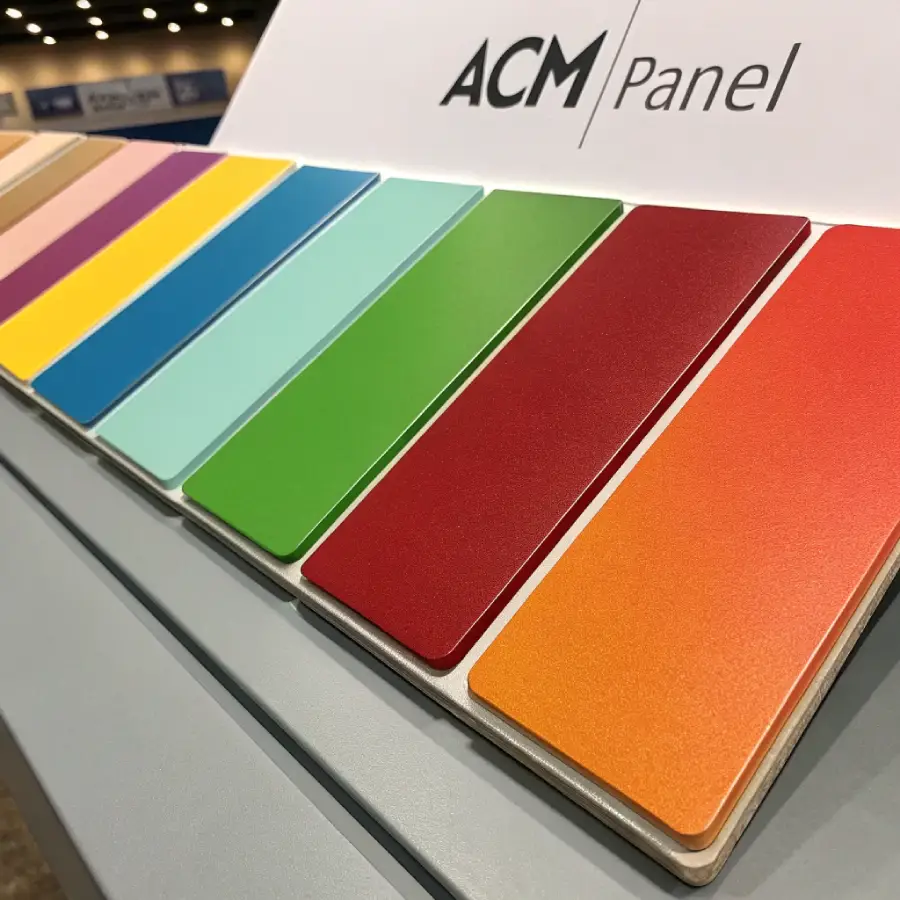
Walk down any street in downtown Toronto and you’ll notice something: the buildings that actually catch your eye aren’t necessarily the tallest or the newest. They’re the ones where someone made a deliberate call on ACM panel colours. A charcoal tower that disappears into the skyline at dusk. A retail strip with a single bronze accent panel that makes the whole storefront look intentional instead of generic. That’s not luck — it’s a colour decision made early, and choosing the right ACM panel colours is one of the most consequential calls in any ACM cladding project.
At Hamoon Construction, we get asked about ACM panel colours almost as often as we get asked about pricing. And honestly, the two questions are related — the ACM panel colours you choose affect cost, maintenance, and how the building performs in Toronto’s climate for the next two or three decades. This guide walks through everything we tell our own clients before they commit to ACM panel colours: what’s actually available, how each finish behaves over time, and how to narrow down the right ACM panel colour for your specific project.
What Exactly Are ACM Panels, and Why Do ACM Panel Colours Matter So Much?
Aluminum composite material (ACM) panels are built from two thin aluminum sheets bonded to a core — usually polyethylene for standard panels, or a mineral-filled core for fire-rated (FR) versions. That aluminum skin is where all ACM panel colours live, and the finish is applied through a coating process (typically PVDF or FEVE) before the panel ever reaches a job site. High-performance coatings that meet the AAMA 2605 specification are tested against a decade of outdoor exposure, which is why premium ACM panel colours hold their tone so much longer than a standard paint job ever could.
Ready to enhance your building with ACM Panels in Ontario for your project?
Here’s the part people don’t always think about: ACM panel colours aren’t paint that you can touch up in five years. The colour is baked into a factory-applied coating designed to last the life of the panel — often 20 to 30 years. That means the ACM panel colour you pick isn’t just a design decision, it’s a long-term commitment. Get it right, and the building looks sharp for decades with minimal upkeep. Get it wrong, and you’re looking at a façade that either fades unevenly, shows every water spot, or simply looks dated within a few years.
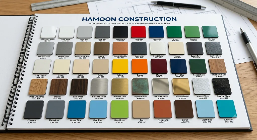
Beyond aesthetics, ACM panel colours carry real functional consequences:
- Heat absorption. Darker ACM panel colours absorb more solar heat, which can push up cooling loads in summer but helps in winter. Lighter and metallic ACM panel finishes reflect more sunlight, which matters a lot during a Toronto July — the same principle behind reflective “cool” building materials that the EPA recommends for reducing urban heat buildup.
- Visible wear. Lighter ACM panel colours show dirt, pollen, and road grime faster, especially on lower floors near street level. Darker tones hide this better but can show water spotting after heavy rain.
- Brand recognition. For commercial and retail clients, ACM panel colour is often the first thing a customer associates with the storefront — it’s doing marketing work whether you plan for it or not.
The Real Range of ACM Panel Colour Options
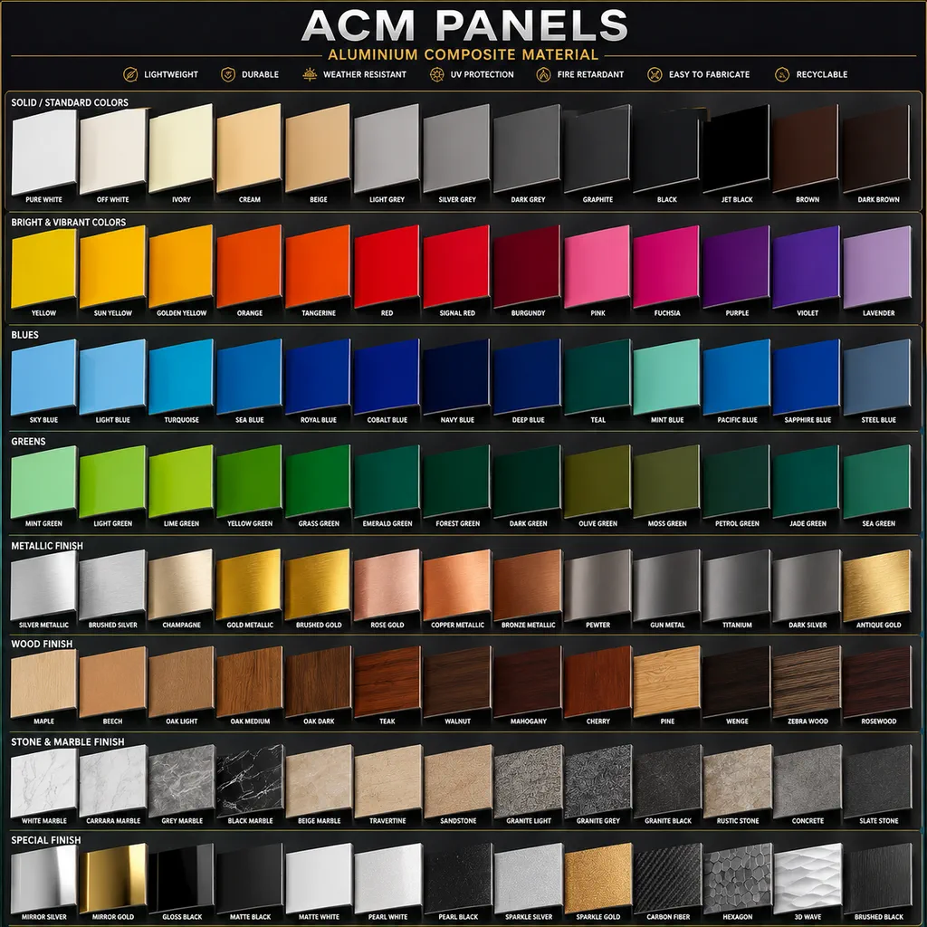
Most people assume ACM panel colours come in a handful of standard shades — grey, white, maybe black. In reality, the catalog of available ACM panel colours is enormous, and it breaks down into a few distinct categories, each suited to different kinds of projects.
Solid ACM Panel Colours
This is the baseline category of ACM panel colours, and it’s still the most common choice for a reason: consistency. A solid-colour panel looks the same in every light condition, ages predictably, and works with almost any architectural style.
- White and off-white remain the go-to choice for clean, minimalist facades, and they’re especially effective on buildings that get a lot of natural light exposure — the panel practically disappears into the design rather than fighting it.
- Black reads as sharp and modern, and it’s a favourite for industrial-style conversions and contemporary infill housing across the GTA.
- Grey, in its dozens of variations, is probably the single most requested shade on our jobs. It’s neutral enough to pair with brick, stone, or glass, and it hides everyday grime better than white without going as heavy as black.
- Bolder solids — blues, reds, greens — show up mostly on retail and hospitality projects where the goal is to be noticed from the sidewalk or the road.
Metallic ACM Panels
Metallic ACM panels use a reflective pigment in the coating that catches light differently depending on the viewing angle — the same panel can look silver in direct sun and almost pewter in shade. This is what gives buildings that “moves as you walk past it” quality that flat solid ACM panel colours can’t replicate.
- Silver and champagne tones are common on office and institutional buildings looking for a polished, corporate feel without going stark white.
- Bronze and copper finishes have become a favourite request over the past couple of years, particularly for boutique residential and hospitality projects. They warm up an otherwise cold material and, depending on the coating, can develop subtle depth over time the way real metal patinas do.
- Gold and other high-shine finishes are rare outside of signage or hospitality accents — striking in small doses, overwhelming across a full elevation.
One practical note we always give clients considering this finish: metallic panels show fingerprints and scuffing more visibly at eye level than solid colours do, so they’re a better fit above the reach zone or on facades that aren’t handled directly.
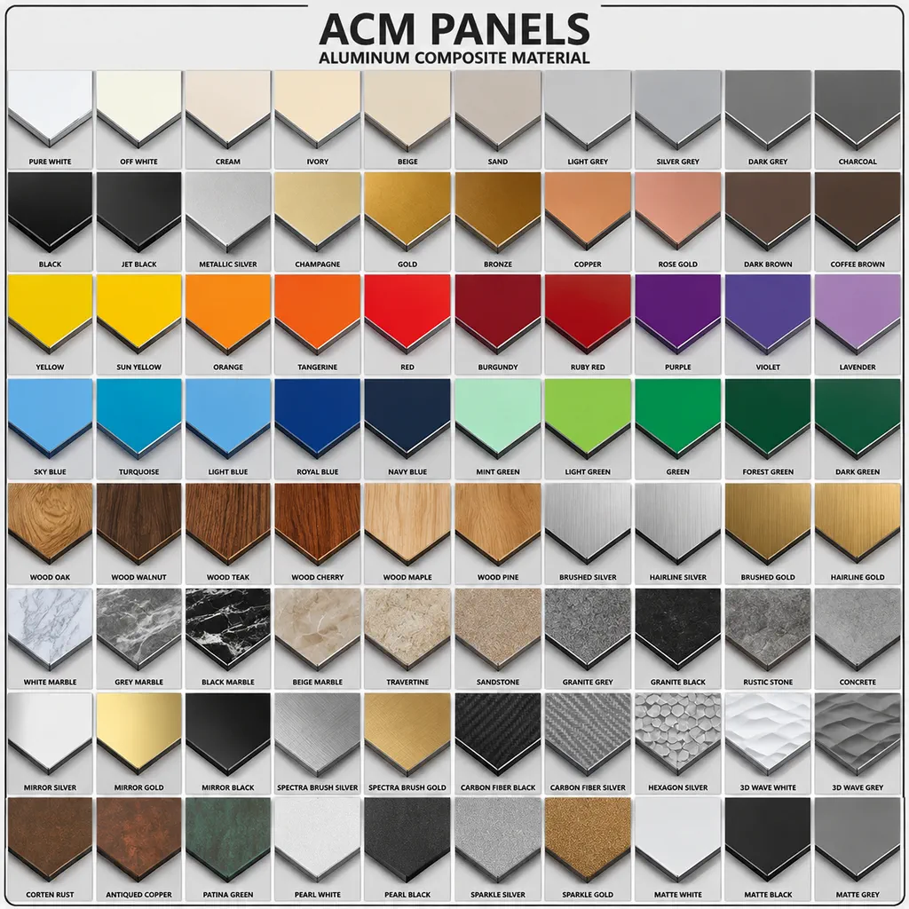
Wood-Grain and Textured ACM Panel Finishes
These ACM panel finishes use a printed or laminated layer to replicate real wood grain — oak, walnut, teak — while keeping the fire performance and low maintenance of aluminum. For projects trying to soften a metal or glass exterior, or for anyone who likes the look of timber cladding without committing to actual wood maintenance (sanding, sealing, insect damage), wood-grain ACM panel finishes are usually the answer. We’ve used wood-grain ACM extensively on residential entrance features and interior soffits across Toronto and Markham, and this ACM panel finish holds up far better than people expect in freeze-thaw conditions.
Custom ACM Panel Colours
For corporate clients, developers with a signature palette, or architects chasing a very specific design vision, most major manufacturers can produce custom ACM panel colours matched to RAL codes or a supplied sample. Custom ACM panels colours are common on multi-building developments where consistency across phases matters, or for retail brands that need their exterior to match interior branding exactly. Custom ACM panels colour runs typically carry longer lead times and minimum order quantities, so this is a decision worth locking in early in the design process — not something to leave until fabrication is already scheduled.
How to Actually Choose ACM Panel Colours for a Toronto Project
Everything above is useful context, but at some point you need to land on an actual decision. Here’s the process we walk clients through when narrowing down ACM panels colours.
Start with the building’s function, not just its looks. A commercial office tower, a retail storefront, and a single-family home renovation all call for different colour logic. Offices generally lean neutral — grey, silver, muted tones — because the goal is to read as professional and timeless rather than trendy. Retail and hospitality can afford louder shades, since the whole point is to stop foot traffic. Residential projects tend to land somewhere in between: distinctive enough to add curb appeal, restrained enough not to clash with the neighbouring homes.
Factor in Toronto’s actual climate, not a generic climate chart. We get freeze-thaw cycles every winter, humid summers, and enough UV exposure in July and August that coating quality genuinely matters when picking a finish. Lighter and reflective tones help manage summer heat gain; darker shades can assist with winter heat retention but will show more visible weathering on south- and west-facing elevations where sun exposure is heaviest. If your building has a strong solar orientation, that should influence the shortlist before anything else does.
Think about what’s around the panel, not just the colour itself. Colour never exists in isolation on a façade — it’s read against brick, stone, glass, landscaping, and neighbouring buildings. A metallic silver panel next to a full glass curtain wall amplifies the reflectivity of both materials. The same finish next to natural stone can look cold and mismatched. Bring a sample to the site and view your shortlisted options against the actual materials they’ll sit beside, in daylight — not under a showroom light or on a laptop screen, both of which shift colour perception more than people expect.
Be honest about maintenance appetite. If nobody is pressure-washing the lower floors twice a year, a pale finish at street level is going to look tired within 18 months in a downtown environment. Darker or mid-tone shades are the more forgiving, lower-maintenance choice for street-facing applications.
Order physical samples before finalizing anything. This is the step people skip most often, and it’s the one that prevents the most regret. Renderings and digital swatches are useful for narrowing down a shortlist of ACM panel colours, but they consistently misrepresent how a coating — especially a metallic one — will actually look outdoors. We provide physical panel samples on every project before fabrication begins for exactly this reason.
ACM Panels Colour Trends We’re Actually Seeing on Toronto Facades Right Now
A few patterns have shown up repeatedly across our recent projects across the GTA, worth mentioning if you’re trying to gauge what’s current versus what’s starting to look dated:
- Warm neutrals over stark white. Pure white is being replaced on a lot of newer builds by warmer off-white tones and light greige, which photograph better and show less contrast against dirt and staining over time.
- Dark charcoal and matte black continue to dominate infill housing and laneway projects, often paired with wood-grain accent panels around entries.
- Bronze and copper-toned metallics are up noticeably on boutique commercial and hospitality builds — they read as premium without the maintenance concerns of gold.
- Multi-tone facades — combining two or three colours or finishes across a single elevation — are increasingly common on mid-rise residential, largely because it breaks up otherwise flat, repetitive panel grids at a lower cost than adding architectural detailing.
Frequently Asked Questions About ACM Panels Colours
What’s the best ACM panel colour for a commercial building in Toronto? It depends on the tenant mix and street presence you’re going for. Neutral ACM panel colours — grey, silver, muted charcoal — read as professional and age well on office buildings. Retail and hospitality clients often do better with a bolder solid ACM panel colour or a warm metallic accent to stand out from neighbouring storefronts.
What ACM panel colour should I choose for a residential façade? Mid-tone greys, warm off-whites, and wood-grain ACM panel finishes are the most requested for homes across the GTA right now. They’re versatile enough to complement brick or stone accents that are already common on Toronto residential exteriors, and they’re forgiving from a maintenance standpoint.
Can ACM panel colours be custom-matched to a specific brand or design palette? Yes. Most manufacturers can produce custom ACM panel colours matched to RAL codes or a physical sample you provide, though custom ACM panel colour runs typically require longer lead times and minimum quantities — worth confirming early if your project has a fixed timeline.
Do metallic ACM panels need more maintenance than solid ACM panel colours? Metallic ACM panels show fingerprints, water spotting, and light scuffing more visibly than a matte solid ACM panel colour, particularly at street level. They generally hold up well long-term, but we usually recommend metallic ACM panels above the reach zone or on facades that won’t be touched directly.
How long will ACM panel colours actually last outdoors? With a PVDF or FEVE coating and correct installation, most ACM panel colours retain their original tone and gloss for 20 to 30 years. UV exposure, orientation, and coating quality are the biggest variables — a south-facing elevation in direct Toronto summer sun will weather faster than a shaded north-facing wall, even with identical ACM panel colours.
Choosing Your ACM Panels Colours With Confidence
There’s no single “correct” choice among ACM panel colours — the right pick depends on the building’s function, its orientation, what sits around it, and how much upkeep someone is actually willing to put in. What matters is going into the decision with real information instead of guessing from a screen swatch.
If you’re planning an ACM cladding project in Toronto or anywhere across the GTA, our team can walk you through physical samples, talk through how different ACM panels colours perform against your building’s specific sun exposure, and help you land on a finish that still looks right a decade from now. Get in touch with Hamoon Construction for a free consultation and colour sample review — or explore our full ACM panels in Toronto supply and installation services to see how ACM panels colours fit into the bigger picture of your façade project.